Mundaine
The Discovery
Mundaine was built on a simple but loaded idea: the word “mundane” rewritten. AI was intimidating more people than it was inspiring, burying them in complexity and noise when the reality was always much simpler. The brief was to flip that — to take something the world had made feel daunting and give it back to people as a tool for the everyday. Automate the mundane. Free up what matters. That premise is right there in the name.
The Design
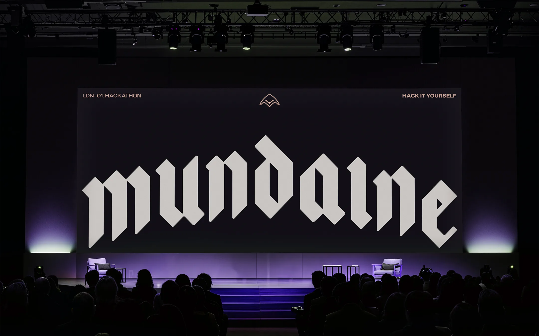
The visual language drew from a world Damian knew well, the effortless cool of 90s skate culture.
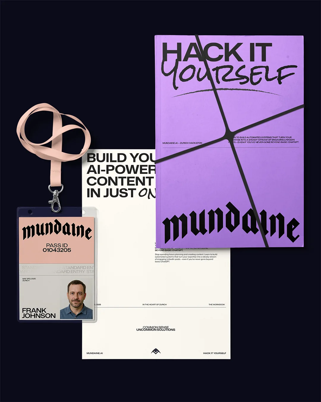
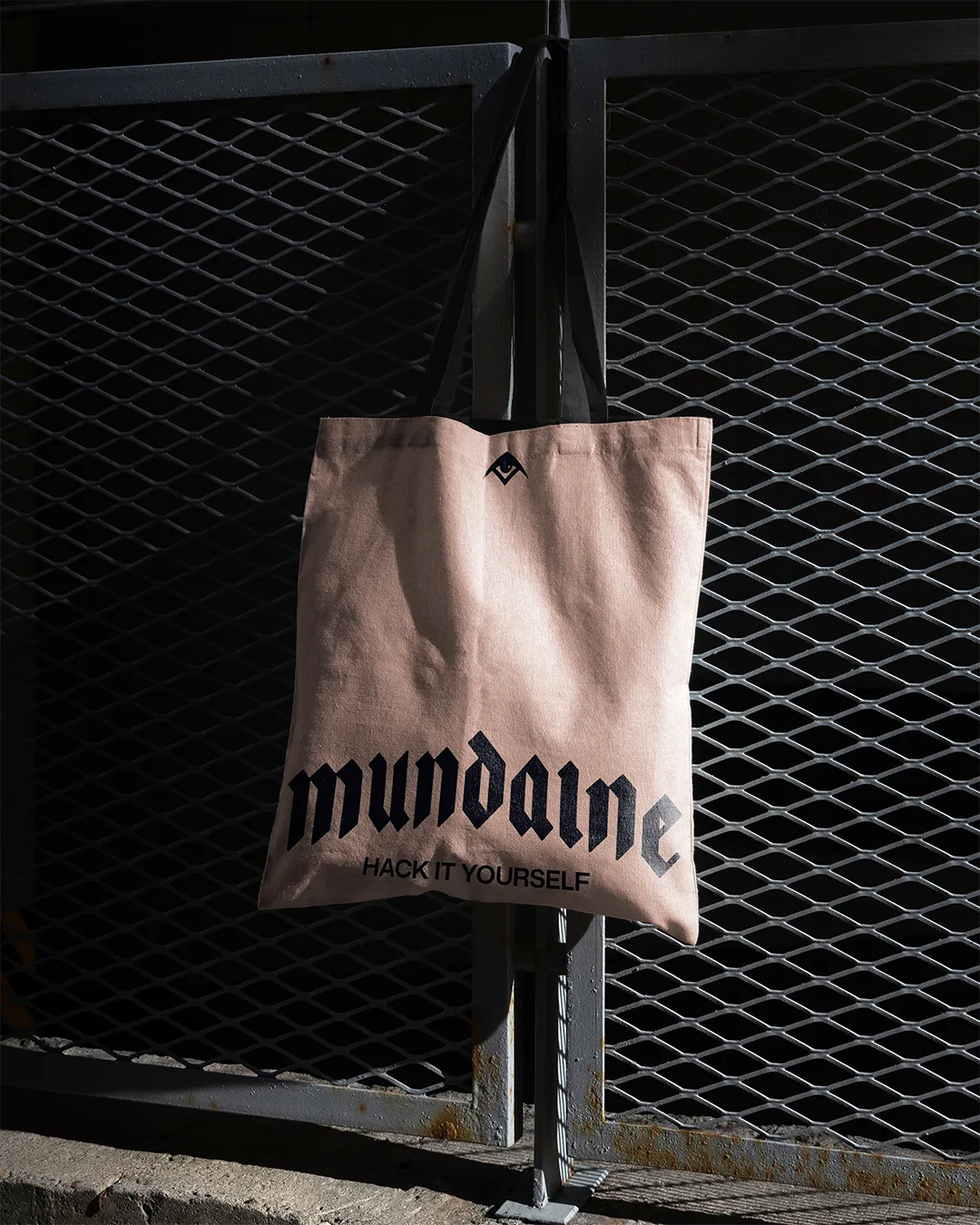
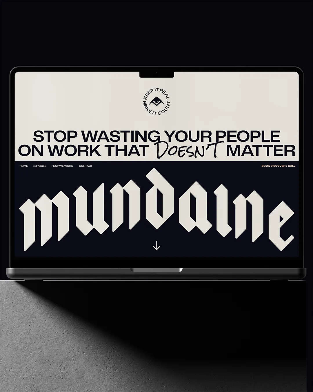
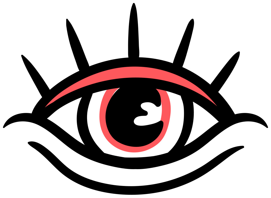
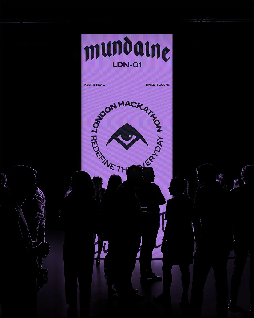
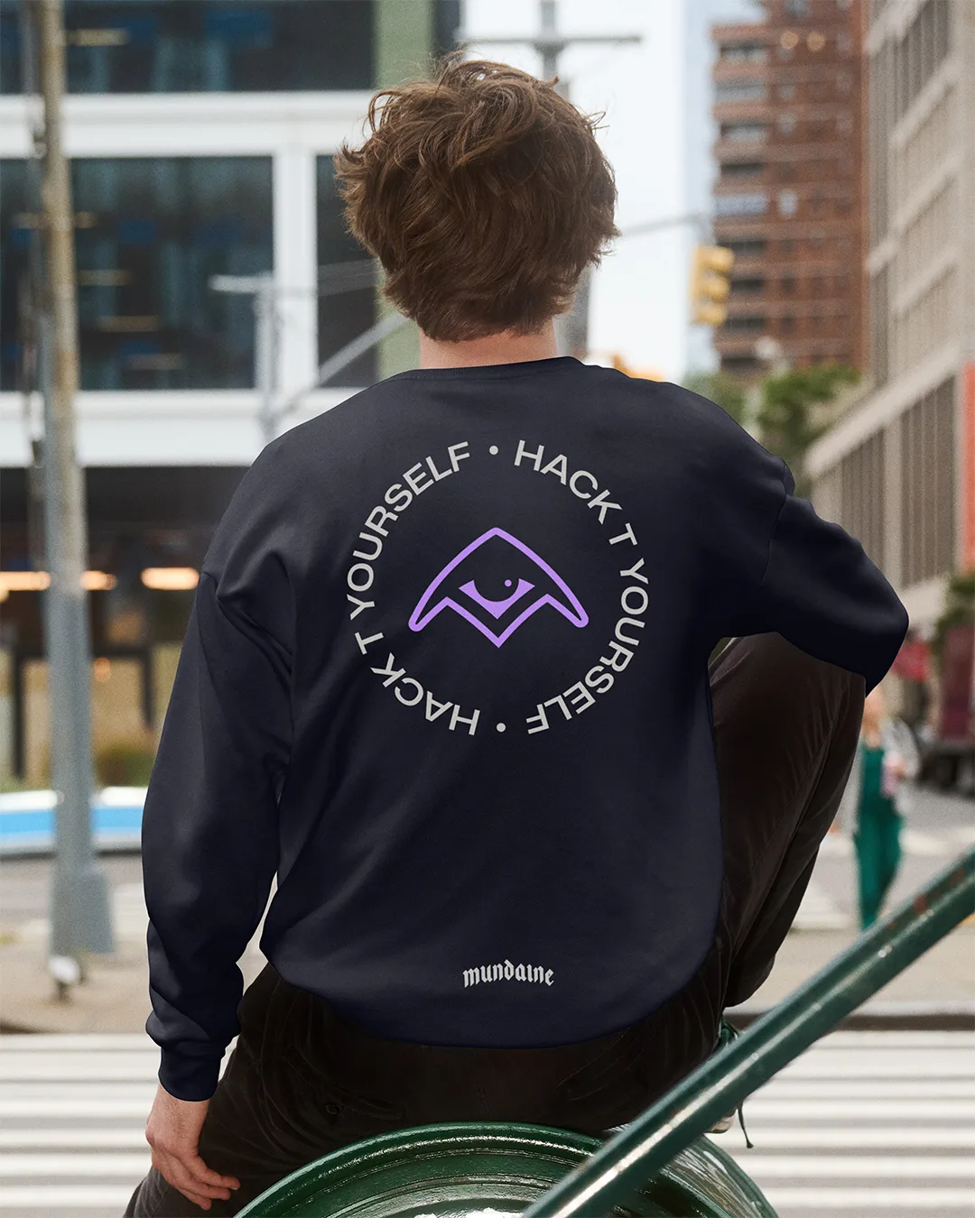
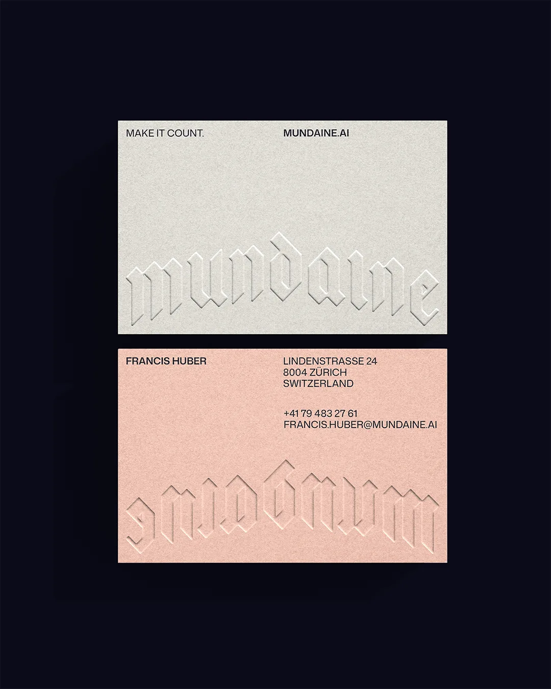
Confidence, not rebellion. The way the best skaters made the hardest things look like nothing. That became the emotional north star. The blackletter wordmark carries that same duality: enough weight and structure to hold its own in any serious context, enough raw character to feel equally at home on a hoodie. The upward arch introduces lift and a widening horizon, a quiet signal that this is a brand about expanding what people think is possible. The symbol is a relaxed eye. Not serene, more like an eye-roll. That rogue expression that says this really wasn't that hard. The palette punches with the same energy: a near-black foundation with Violet, Coral, and Bone cutting through it. Disruptive, warm, unapologetic.
The Delivery
We built a complete logo system, comprehensive brand guidelines, and a character-led illustration world designed to carry the philosophy further than the mark alone could.
The fox and the raccoon weren't chosen arbitrarily — they embody a tension that sits at the core of the brand: drive and creativity, logic and intuition, the push to get things done and the freedom that comes when you do. Together they tell the story Mundaine is really about. The identity was built to flex across collateral, merch, digital, and beyond, with “Hack It Yourself” threading through everything as both a provocation and a promise.