Crusty Boys
The Discovery
Frozen pizza had a problem. Everything in it tasted like a compromise. Mike had spent years obsessing over pizza, testing and retesting until people's reactions told him something the market hadn't figured out yet — that the gap between a freezer aisle and a genuinely great slice didn't have to exist. Not a restaurant, not a food truck. A brand that could put real pizza on a shelf and let the product do the talking. Crusty Boys was born from that space between what frozen pizza was and what it had no excuse not to be.
The Design
The visual world draws from something deeper than skate culture alone.
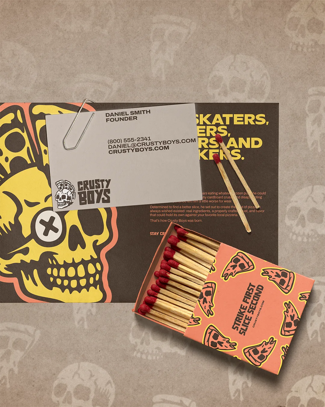
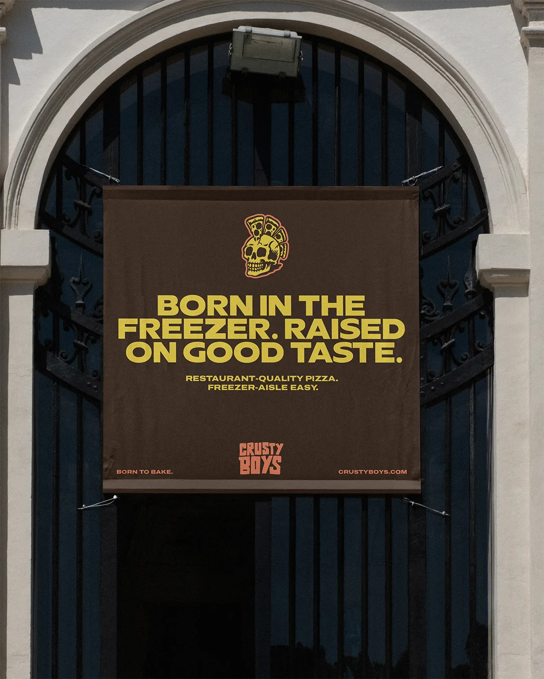
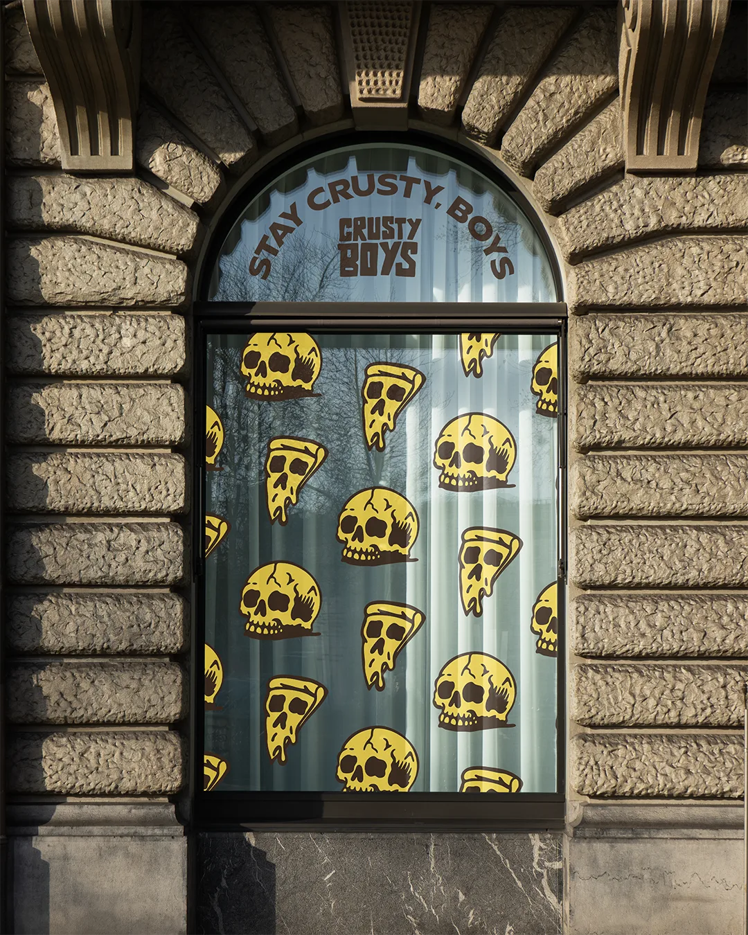
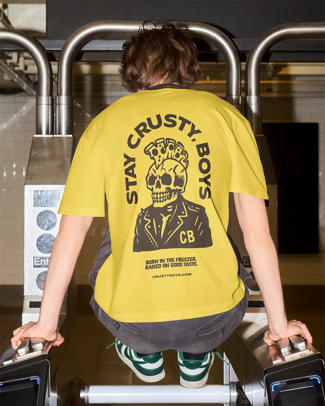
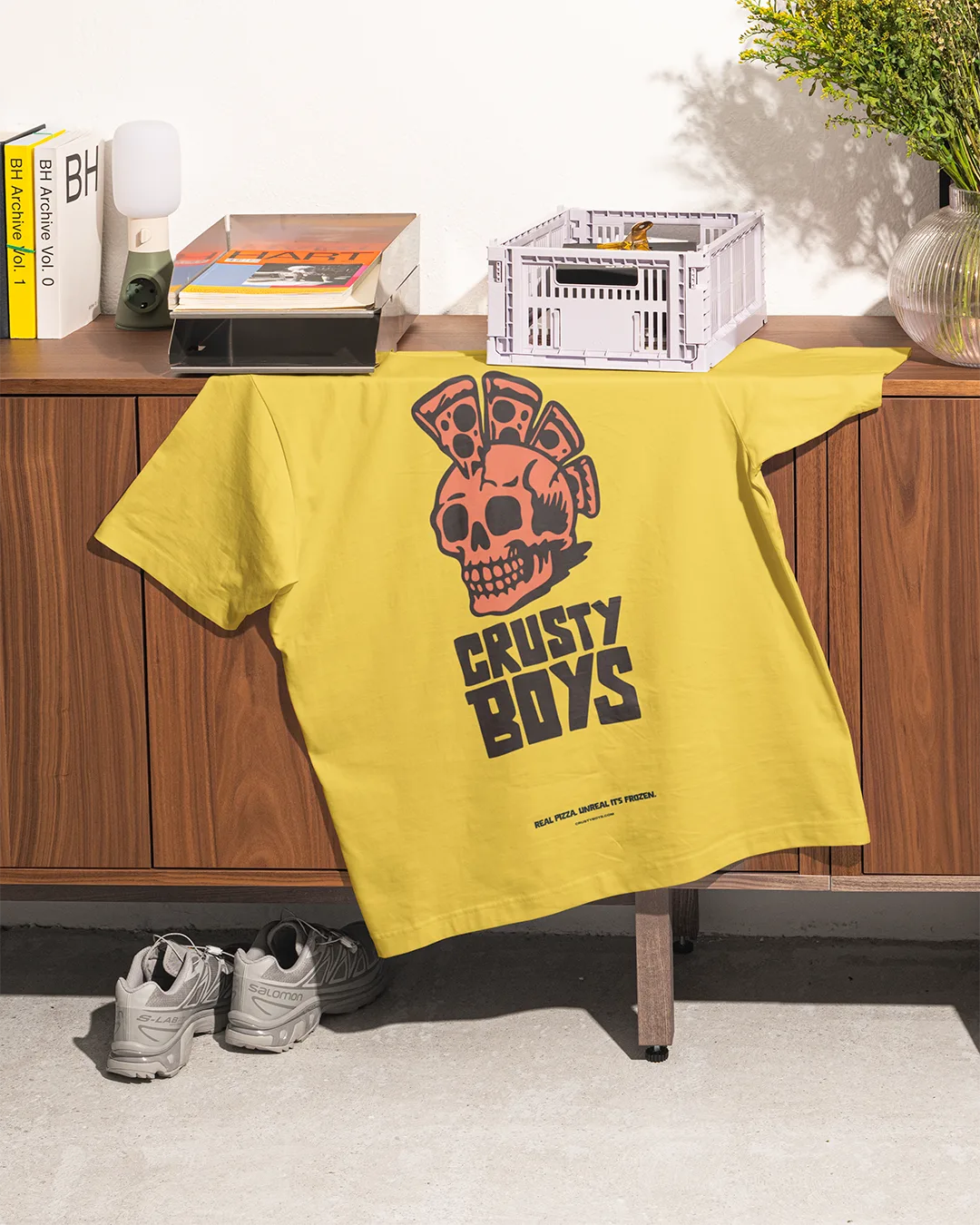
The colour palette and logotype carry a warm, nostalgic charge — the kind that belongs to 80s and 90s adventure. The thrill of something slightly dangerous and completely unforgettable. Crusty sits at the centre of it: a skull with a pizza slice mohawk and a permanent attitude, part mascot, part cult figure. The logotype is heavy, blocky, and built for impact — something that reads fast and lands hard. Crust yellow and warm coral cut against a deep chocolate brown — the kind of palette that makes you feel like something good is just around the corner.
The Delivery
The identity is built to flex.
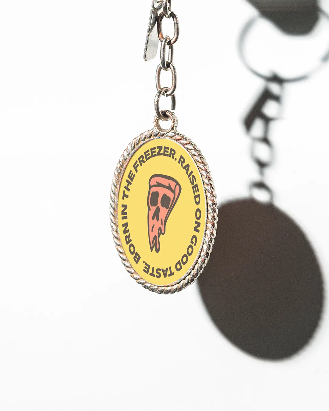
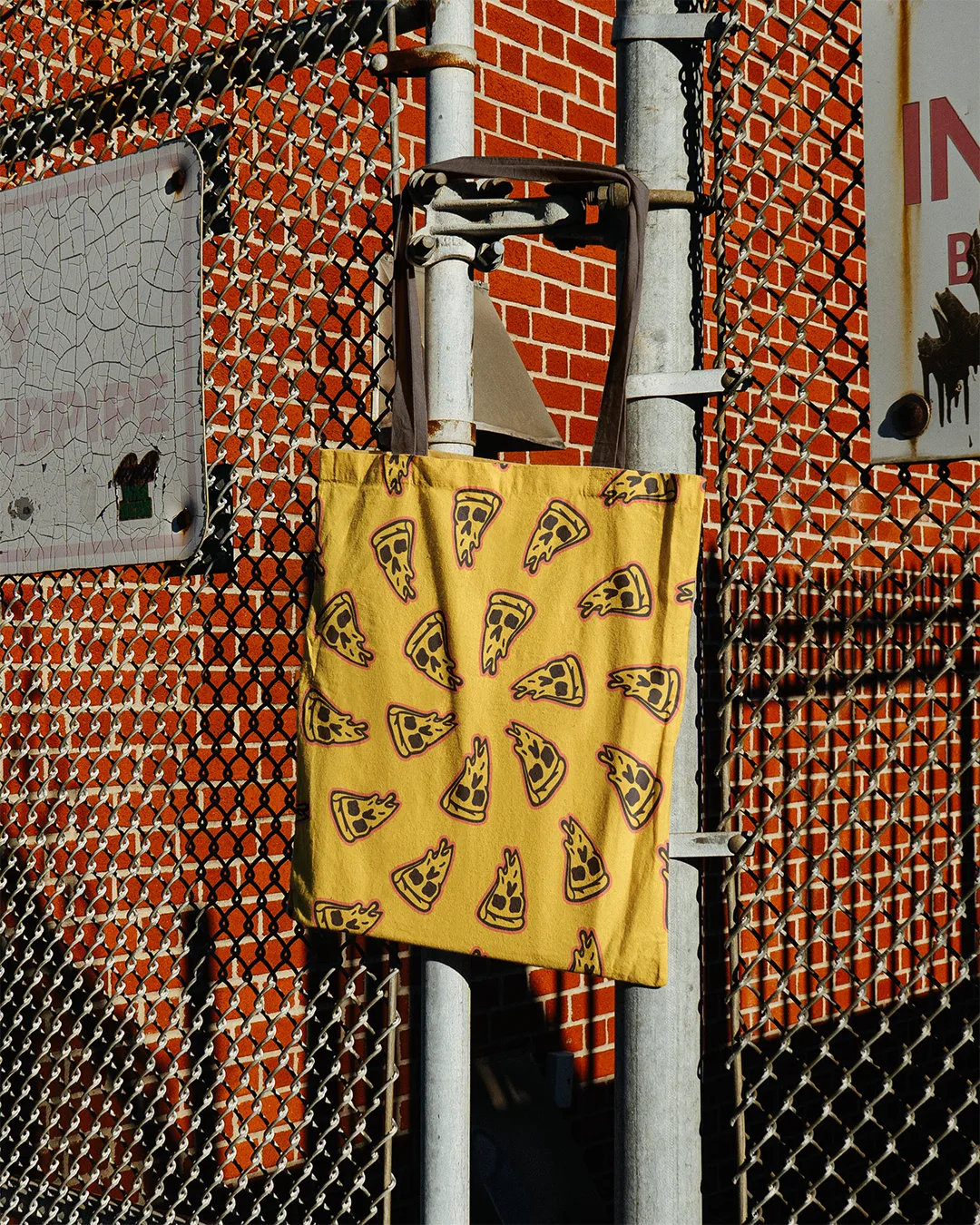
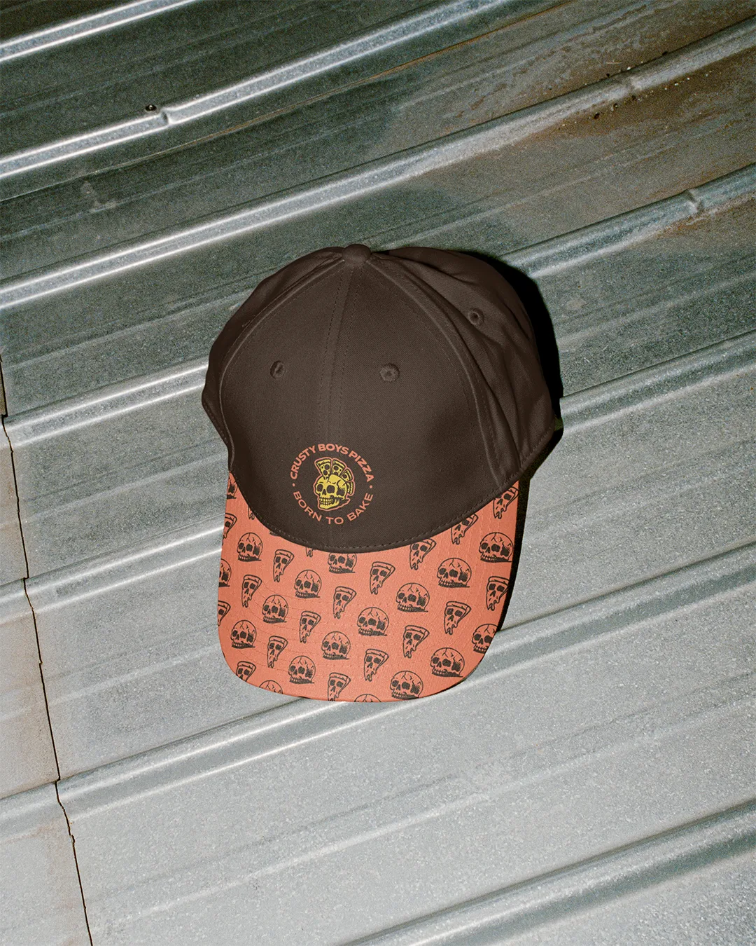
Crusty shifts across different expressions and character states, giving the system room to breathe without losing its anchor. Repeating skull and pizza slice patterns carry the brand across packaging, apparel, and print with the same irreverent energy as the mark itself. The result is a visual world with enough personality to build a following and enough structure to scale — from a regional shelf to wherever the brand takes it next.